Illustration projects are always enjoyable for me to create for clients. And illustration projects that have plenty of room for humor, creativity, and play usually turn out to be the best! This project that I worked on for Johnston Group Inc., wellness posters for workplace inspiration, fit that bill!
Johnston Group Inc. approached me to help them create these wellness posters for workplace inspiration. Johnston Group is a benefits service provider for companies and employees across Canada. They had put thought into concepts for an email giveaway campaign for their 200k+ subscribers. It turns out that they weren’t completely satisfied with the concepts that they had come up with. It was at this time that I connected with Matt Johnston. He shared with me some great starting points for the kind of messages they were looking to publish.
The best thing about working with Matt and Johnston Group was their complete trust in my creative abilities and process. Matt pointed in a direction with a concept and I went into the lab and emerged with the concepts. Matt gave quick feedback, was positive throughout, and flexible on time expectations which allowed the ideas to incubate. I approached the project though the mindset of ‘What would I actually pay attention to if I was in an office?’
We co-created 3 posters in all and began with this one below.
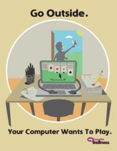
Wellness Posters For Workplace – Go Outside
Matt spoke to me about encouraging people to take breaks from their work as a way to feed their health and productivity. He spoke about going outside, getting fresh air, and connecting with nature as ways to be more balanced and healthy in relationship to work.
I personally connected to this concept because I’m a big fan of a book called The Power of Full Engagement by Tony Schwartz. In the book he suggests taking a break every 60-90 minutes in order to give your brain and body a rest. This practice optimizes your energy for work throughout the day. This was one big reason I could see myself putting this on my own wall and heeding its advice!
For the concept itself, I thought about how solitaire is played on desktops and about the trackpads on computers. I imagined that if a computer played a game on itself, it would be solitaire! From there, I imagined a world where the office was more alive when the worker within it went outside. It’s a win-win in that the office gets to play at the same time that the worker is rejuvenating!
The concept below was the 2nd image we worked on together.
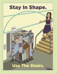
Wellness Posters For Workplace – Stay In Shape
The main purport of the message that Matt wanted to deliver with this image was to stay active. He wanted to bring more awareness to the mindset of making conscious choices to consider your physical health and activity level.
Taking that into consideration, I wanted to create an image that was not about shaming people for being out of shape. I wanted people to relate to being in shape from a fun place of empowerment. I imagined that the natural state of being in shape is your natural form. It’s stuffing yourself into ‘shapes’ and doing what the herd does that gets you into trouble.
The third and last image in the series of 3 is below.
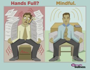
Wellness Posters For Workplace – Hands Full? Mindful.
The main message here is two-fold. First, consider some form of meditative practice to combat the challenges of everyday work life. Second, pay attention to the way you relate to your work as it may not be very mindful. In speaking with Matt, he mentioned encouraging mindfulness practice in his company and believing it to be beneficial to suggest to other companies too.
The attention-grabbing element in this image is the pose the character is in. It’s the same pose in both the ‘Hands Full?’ cell and the ‘Mindful’ cell. I’m attempting to communicate that the main thing that has changed for this character is how he is being and relating to his work. His circumstances are the same but he’s choosing to use mindfulness to produce a more ordered and calm relationship to his work. I can get into frenzied states when I’m working and to have a reminder that lets me know it’s both ok and imperative that I slow down, is key.
Finally, if you’re reading this and now considering illustration as a way to communicate some important message as a way to provide more value to your audience, send me a message.
I’ve found that the best ideas require space and time to be fleshed out and to emerge. Quality ideas that grab attention and STICK will get engagement over time. I’d suggest going in a thoughtful, artful direction with real intention rather than a quick, cookie-cutter approach to engagement.
Thank you for stopping by!
Nick


