Explainer Video - What Is Shuttercard?
This is an animated explainer video I created created for a startup called Shuttercard in 2012. Shuttercard was an online service for photographers created by Tiffany and John Zumbrun.
At the time this video was created, animated explainer videos were fairly new on the internet scene and this was the second explainer video I had ever created for a client. Though it’s an older video, it’s included in my portfolio because I feel it has a little bit of everything in it while being created with the fresh zeal of finding a new medium as an artist!
It has very simple art and characters, interesting explanations, some good spots of humor, moments of catchy creativity, and most importantly, it did the job of explaining John and Tiffany’s service, Shuttercard, in an engaging way.
Video Process - The Making of 'What Is Shuttercard?'
The creation process for the video was easy and straightforward. Tiffany and John allowed me to write the script, craft a relevant and playful story around the audience they were speaking too, and even let me do the voiceover! It was a very ‘hands off’ project, which is nice in some ways
The audience for the video, event photographers, was fairly niche and their product spoke to a very specific problem – the cost of doing business as a photographer at events. John and Tiffany sought to make that venture easier by helping photographers get paid for their work by making it easier for customers to print them at home instead of the photographer having to do it all up front.
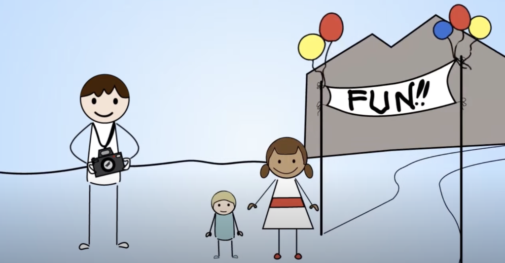
My thinking while making this video was that because Shuttercard was a brand new startup and they didn’t have a lot of leverage when it came to photographers knowing they existed, it was worth taking a fun risk with this video. As you’ll see, it’s made with very simple, 2-D half-stick figure characters, uses minimal environments, and has some fun with the scripting and with the sound fx.
The main setting for the video is a fantasy event I came up with called the ‘Fantastic Fun Festival’. This is where all the characters interact (aside from when they in their respective homes). The festival acts as a common contrasting scene between those who are attending events for fun versus those who are working at events.

I also thought that since photographers are ‘creatives’, they’d appreciate some fun and creative storytelling twists in the messaging. Having been a young creative myself in 2012, I knew what it was like to begin freelancing on my own. There were struggles! And so I also thought that newer photographers would identify with some of those ‘creative struggles’ that can come with blending the demands of being an art and a business person.
For that ‘struggle’ side of things, I used some visual storytelling elements that became part of what made the video fun and engaging to watch.
First, the main character drives an old car with a hubcap that rolls off when it stops. Then theres his laundry that gets tied up with the camera equipment. Thirdly, there is his slipshod photo booth to reflect his shoestring budget! I wanted those who saw the video to chuckle at the story while being able to connect to the main characters struggles BUT to also look and find hope in Shuttercard.
And to round out the main characters and storytelling in the video theres a couple of ‘local yokels’ who get their photo taken with the bear they have recently won at the fair. Before the main character has found Shuttercard, he’s covering the costs for the couple and after he finds Shuttercard, he gets paid quickly and without extra printing overhead and they get the photo of them with their bear at the fair! It’s a true win-win with Shuttercard helping him out.

Two of my favorite parts of the storytelling in the video are actually in the final scene and shot.
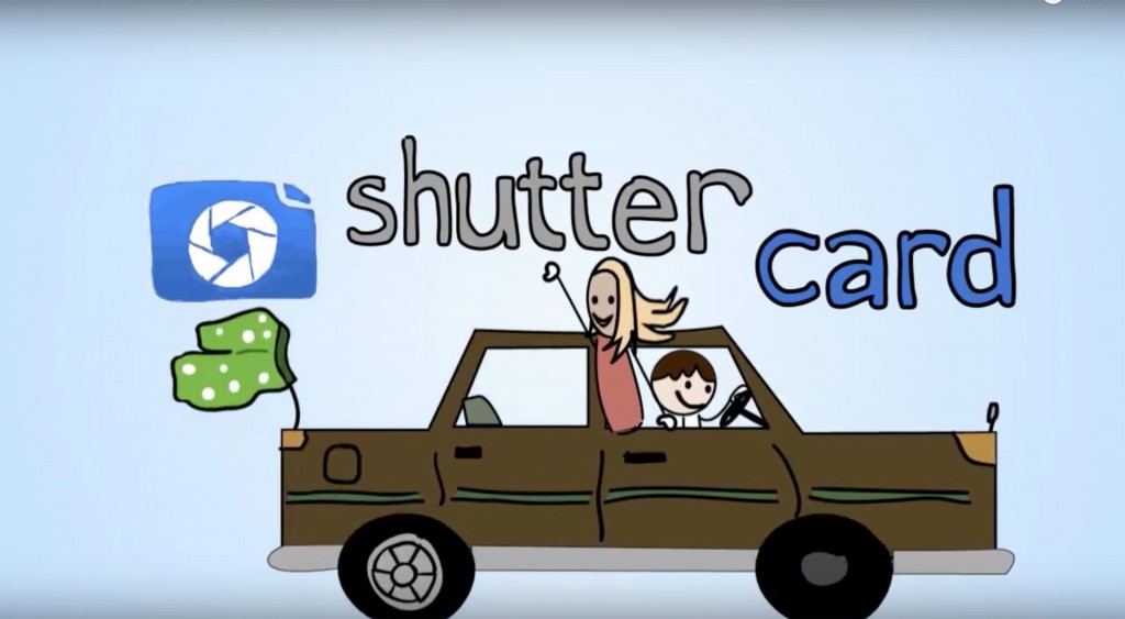
First, it’s when you see the photographer driving away and in the passenger side is a woman who he had met at the event (and had laughed at him in his previous, struggling state). The idea was to convey his newfound confidence now that he has some assistance in his photography-printing game with the help of Shuttercard. Then you see that he’s also still the same ol’ guy as his boxer shorts now dangle from the car’s back antennae and land on the Shuttercard logo to leave the viewer with a silly memory.
I then say on the voiceover ‘Get paid in a flash’. This was a slogan I came up with while writing the script. I thought it conveyed exactly what the service did (helped photographers get paid fast) and then played on the ‘flash’ that comes with taking pictures with a camera! It’s small, creative things like this in a project that have the potential to become big impactful concepts to companies and brands. And this is what I love most about generating creative ideas for others.
Finally, there is a little bit more backstory to the creation of the video, the inspiration for it, and the energy I brought to the project. When I created this video I was new to making explainer videos. I had spent years drawing from life and studying art in a classical manner and had switched to a more illustrative way of making art and working to use my art skills to help people with their marketing communication. It was a whole new world to me.
And well, luckily there are good teachers and guides to help when starting new paths. For me, a chief inspiration at the time of the video was a gentlemen named Miguel who ran a company that created cool explainer videos called Grumo Media. With his help, I had began my storytelling with animation and made one video previous to this one with his help.
After that, he offered to interview me which I took as an opportunity to create and share more animation! It was his influence at the time that helped me begin to think through animation in fresh ways and also allowed me to start bringing through my own, new voice around things.
Watch the video right above for an extra dose of my early animation efforts and to see how I looked at making videos at the same time I made this Shuttercard video above.